This job has proven to be the biggest challenge as I helped build a company from the ground up. We aim to create a tight-knit network of companies from all service areas (construction, commercial, residential, fitness, health, design, etc.) to become our "preferred providers" of their expertise. This will drive real local leads between us all, strengthen our connection as local businesses, and grow and support each other.
I work with a small team of 2 web developers and 1 other graphic designer to curate the perfect website for our business.
The website is coded from the ground up and hosted by Scene It. It is ADA and WCAG-compliant for text and color choices. As we partner with more businesses, we aim to add more accessibility features, such as language translators, contrast heighteners, and text enlargers.
Take #1
Our very first vision with the website was similar to Angis, Catch Des Moines, and CITYVIEW. We wanted to create a website that recommended a bunch of local Des Moines businesses, restaurants, bars, services, and more. Our idea is to list all the places that true locals love that may not even pop up on Google Maps or Yelp. Our Angi-like vision comes into play when we want to hyper-localize the services Angi offers to the Central Iowa area. We did not want to promote huge chain stores but more mom-and-pop shops to truly shop locally.
Style Tile
I worked on the style tile first to try and capture the essence of what we wanted to make. I researched colors to see what emotions they incite. I saw that red is super popular in fast food places because it incites hunger and exploration (see McDonald's, Burger King, Chick-fil-A, and more!). I wanted an elegant feeling to the website because it uplifts the subject we are trying to highlight which is the city of Des Moines.
Click on the buttons to see the first iteration of the website weba nd mobile created in Adobe XD.
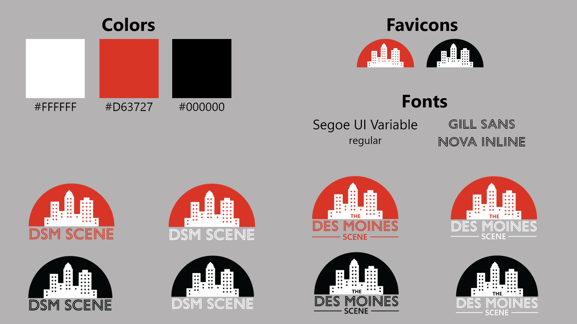
Take #2 Style Tile
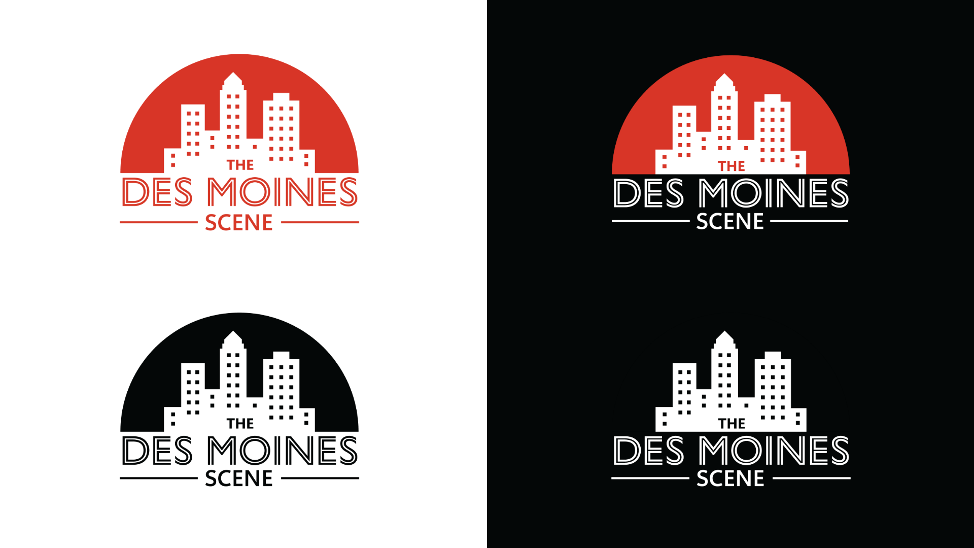
Another graphic designer joined the team and developed a new logo. Our boss, the other graphic designer, and I agreed to change the colors to something more simplified.
#3rd Times a Charm: Scene It
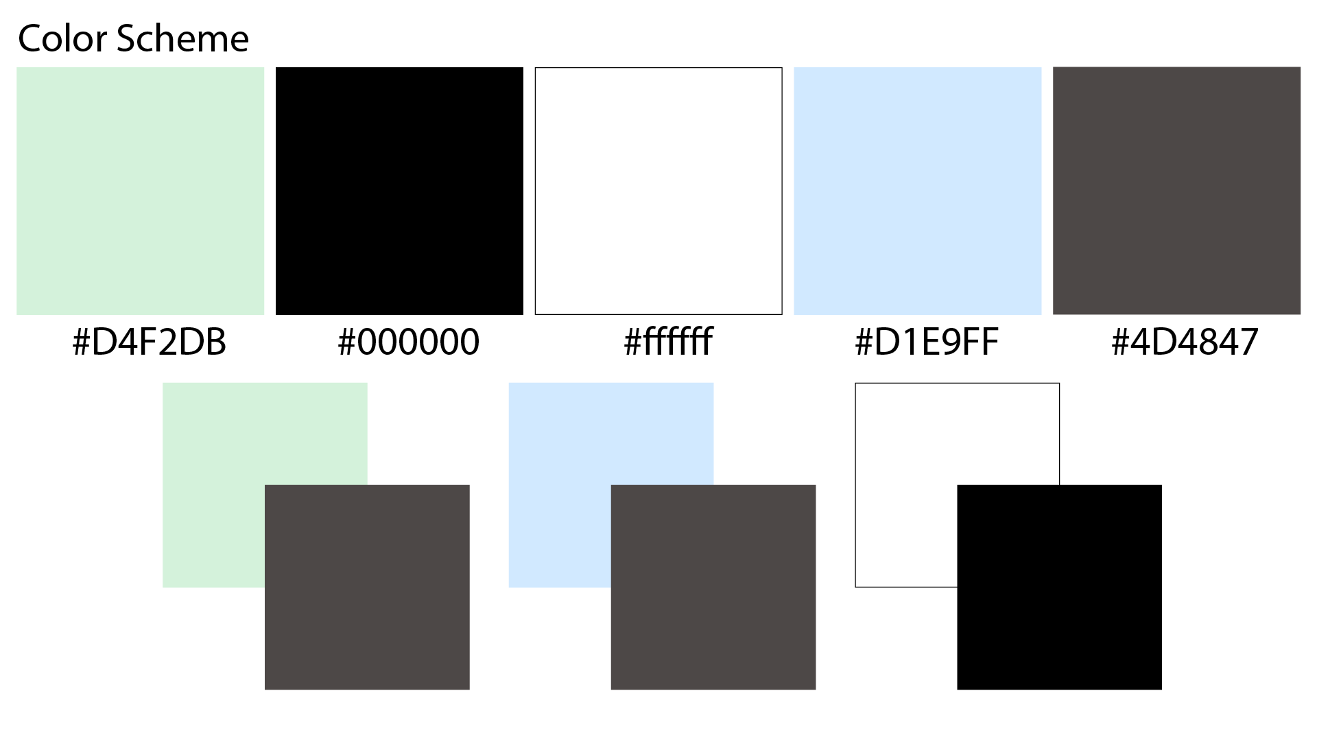
The entire scope of the project changed to become something entirely new as per our boss's request/vision. The other graphic designer and I created an entirely new color scheme, logo, and style tile; our product name also changed.
Click this button to view our new website layout. We had a hefty discussion with our boss about how he wants the user interface to look. We needed him to love what we had completely to continue forward with our development. We did give him our input as designers for the navigation, filtering options, and other settings. But, overall, his say is the last say.
FINALLY, LIVE
THE LIVE WEBSITE!
<<<<<
